Creator Landing Pages: The Complete Guide (2026)
Everything you need to know about creator landing pages in 2026. How to choose the right tool, build a page that matches your brand, set up affiliate links, and turn your link in bio into a revenue engine. The definitive guide from someone who builds this stuff.
The gap between your Instagram and your link in bio
TL;DR
Creator landing pages are the single most important piece of internet real estate creators own. Choose a tool that matches your brand aesthetic, not just the one everyone else uses. Set up your affiliate links properly (ShopMy for premium brands, LTK for app discovery, Amazon for breadth). Feature your best content, organize links by what visitors want to do, and refresh monthly. This guide covers every step from choosing a tool to turning your page into a revenue engine.
Key takeaways on creator landing pages
- Creator landing pages outperform default templates when they reflect your real Instagram aesthetic, not a stock theme.
- Match your color palette, fonts, and voice across feed and page so visitors feel the same brand within two seconds.
- Use your strongest Instagram content as hero imagery instead of logos or stock photos.
- Pick the right tool for the job: Linktree for simplicity, Stan Store for digital products, Beacons for all-in-one, Carrd for design control, Coreli for AI-generated pages that match your aesthetic.
- Set up affiliate links (commission-based product links from platforms like ShopMy or LTK) to monetize your page properly.
- Refresh monthly. A creator landing page is a living storefront, not a set-it-and-forget-it asset.
You've spent months, maybe years, building an Instagram presence that feels distinctly you. Every image is intentional. The colors, the composition, the way you caption your posts. Your audience knows your work the second it shows up in their feed. That's why creator landing pages matter so much: they're the bridge between your Instagram aesthetic and everything you want visitors to do next.
Then they tap the link in your bio.
And they land on a page that looks like everyone else's. A white background. A stack of buttons. A generic headshot that doesn't match the editorial quality of what brought them there in the first place.
That's the gap this guide is about. Not just the tools (though we'll compare the best creator landing pages platforms), but the strategic thinking behind your creator landing page: what it should do, how it should look, how it connects to your revenue, and why getting it right matters more in 2026 than it ever has.
The creator economy is projected to exceed $250 billion globally in 2026, with more than 207 million active creators worldwide. Over 31 million Instagram users currently use a link-in-bio tool, and 64% of those users are women. The space is massive, and your landing page is the front door to all of it.
This guide covers everything from choosing the right tool to setting up affiliate links to making your brand aesthetic actually carry through to the page your audience visits. If you're a multi-hyphenate creator juggling content, commerce, and community, this is the resource I wish existed when I started building Coreli.
What are creator landing pages and how are they different from link-in-bio tools?
A creator landing page (the standalone page visitors see after tapping your bio link, designed to represent you across multiple platforms) is the single URL you put in your Instagram bio, your TikTok profile, your YouTube description, your email signature. It's where your audience goes when they want more from you than a single post can deliver.
Most people call this a "link in bio." That name undersells what it should be.
A link list is a list of buttons. Click this for my podcast. Click that for my shop. Click here for my newsletter. It works, but it communicates nothing about who you are. It's a directory, not a destination.
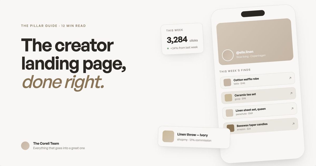
A creator landing page is different. It's a page that represents you. It shows your best content, your aesthetic, your personality, and your revenue streams in a layout that feels like a real website, not a parking lot of links. Think of it as the homepage you never built, generated in minutes instead of months.
The distinction matters because of how people arrive there. Someone tapping your bio link is already interested. They saw a Reel, loved your outfit, read a caption that resonated. They're warm. Your landing page either converts that warmth into a follow, a click, a sale, or it lets them bounce back to scrolling.
What good creator landing pages always include
- A hero image pulled from your strongest Instagram content, not a logo or stock photo.
- Color palette and fonts that mirror your feed within two seconds of landing.
- Embedded video or Reels (not just text links pointing elsewhere).
- Clear monetization paths (affiliate links, products, newsletter signups) prioritized by what drives revenue.
- Mobile-optimized layout because roughly 96% of Instagram traffic arrives on mobile.
- Analytics so you can track which links visitors actually click.
Why generic link-in-bio pages cost you money
This isn't abstract. When your landing page doesn't match the quality of your content, you lose clicks, and clicks are revenue.
If you're an affiliate creator with ShopMy or LTK links, every visitor who bounces from a generic page is a commission you didn't earn. If you sell digital products through Stan Store or Gumroad, every confused visitor who can't immediately find your shop is a sale you lost. If you're growing a newsletter through Substack or Beehiiv, every person who leaves without subscribing is a reader you'll never reach again.
Creators who use dedicated landing page tools with analytics and branding see meaningfully higher engagement than those using platform-native link features alone. The reason is straightforward: a branded, well-designed page builds trust faster than a list of blue links.
Your Instagram aesthetic is doing the hard work of making people curious. Your landing page needs to continue that story, not break it. We wrote a full piece on why your link in bio needs to match your brand aesthetic that goes deeper into the psychology and practical impact.
How to choose the right tool
There are more link-in-bio tools available today than at any point in the creator economy's history. Instagram itself now supports up to five links directly in your bio. Linktree has over 50 million users. Beacons, Stan Store, Milkshake, Carrd, Later's Linkin.bio, and newer entrants like Coreli all compete for the same real estate.
The honest truth: none of them is universally best. The right tool depends on what you're trying to accomplish.
Here's how to think about it:
- If you just need a few links and nothing else, start with Instagram's native five-link feature or Linktree's free plan. Both are fast, both are free, and for creators who don't monetize through their bio link, they're genuinely sufficient. Linktree's paid plans run from $8/month (Starter) to $35/month (Premium), with the higher tiers unlocking custom branding, analytics, and recently added features like scheduling and AI caption writing.
- If you sell digital products, courses, or coaching, Stan Store is built for conversion. The checkout happens directly on the page, there's no redirect to a third-party shop, and the AutoDM feature (automatic DM replies with purchase links) is a strong revenue driver. Plans start at $29/month with 0% platform fees. Creator Pro at $99/month adds email marketing, upsells, and funnels.
- If you want an all-in-one platform for links, email, products, and analytics, Beacons packs the most features into its free tier. The AI-generated media kit, brand outreach tools, and Beam AI teammate make it especially useful for creators actively pitching brand deals. Paid plans start at $10/month (Creator), with the $30/month Creator Plus dropping transaction fees to 0%.
- If you want total design control and you're willing to build it yourself, Carrd is the cheapest option at $9/year (Pro Lite) or $19/year (Pro Standard with custom domains). You get complete layout freedom, but you're also doing all the work from scratch with no Instagram integration.
- If your Instagram aesthetic matters and you want a page that reflects it without building from scratch, that's why we built Coreli. Enter your Instagram handle, and it generates an editorial-style landing page that pulls your aesthetic, content, and brand voice into a layout that looks like a designer made it. $29/month. We're newer and smaller, and custom domains aren't available yet, but the design quality is the whole point.
We wrote a full, honest comparison of all these tools in our best Linktree alternatives for creators guide, with real pricing, real tradeoffs, and real opinions on who each tool is actually for.
How to build a landing page from your Instagram
The fastest path from "I need a better link in bio" to "I have a page I'm proud of" starts with your existing Instagram content. You've already done the creative work. A good creator landing page should leverage that, not make you redo it.
The general process, regardless of which tool you use:
Start with your strongest content. Your hero image should be one of your best-performing posts or a professional photo that represents your brand. Not your logo. Not a headshot from three years ago. The image that makes someone stop scrolling.
Write a one-line description that tells visitors who you are and what you do. Not your Instagram bio (which is written for discovery), but a clear statement for someone who already found you and wants to know what you offer. "Fashion and interiors creator sharing what I wear, how I style my home, and everything in between" tells a visitor exactly what they'll find.
Organize your links by priority, not by category. Your most important link (the thing that generates revenue or grows your audience) goes first. For most creators, that's either a shop, a newsletter signup, or a flagship piece of content. Everything else is secondary.
Feature your best Reels. If you're getting traction with short-form video (and most creators are), embedding your top Reels on your landing page gives visitors a reason to stay. It also shows your personality in a way that static links can't.
We wrote a step-by-step walkthrough in how to create a landing page from your Instagram, including specific guidance for each major tool.
Setting up affiliate links properly
Affiliate revenue is one of the most common income streams for Instagram creators, and your landing page is where a significant portion of that revenue either converts or dies.
The two dominant affiliate platforms for Instagram creators in 2026 are ShopMy and LTK (formerly rewardStyle/LIKEtoKNOW.it).
ShopMy has grown rapidly, with over 200,000 creators on the platform. It offers direct commissions from brands (typically 10-25%), weekly payouts, a Talent Card feature that serves as a portable media kit, and a product discovery tool called Snapshop. ShopMy links work natively on any landing page since they're standard URLs you can place anywhere.
LTK has been in the affiliate space longer and reports over 40 million users shopping through its platform. Commissions vary by retailer (typically 5-25%, averaging around 16%). LTK has invested heavily in AI features like a shopping chatbot, Quick Collabs for faster brand partnerships, and Visual Search. LTK links traditionally live within the LTK app ecosystem, though creators can add them to any landing page using custom link features.
The key difference for landing page strategy: ShopMy links can be placed directly on most platforms without friction. LTK links work best when you use the custom link feature in your landing page editor to add them alongside your other content. Both approaches work. The choice of platform depends more on which brands you work with and which commission structures serve you better.
We covered the full setup process in how to set up affiliate links for Instagram creators, and we did a direct head-to-head comparison in ShopMy vs LTK: which affiliate platform is right for you.
Making your brand aesthetic carry through
This is the part most guides skip, and it might be the part that matters most.
Your Instagram grid is a curated visual experience. Every post has been edited, filtered, composed. Your followers have developed an unconscious expectation of what your content looks and feels like. When they leave Instagram and visit your landing page, that expectation needs to be met.
Brand consistency across touchpoints isn't just a design preference. It's a trust signal. When someone lands on a page that visually matches the content that brought them there, their brain registers it as "same person, same quality, safe to engage." When the visual language shifts dramatically (from warm, editorial photography to a cold white page with sans-serif buttons), it creates friction. Not enough to make most people consciously notice, but enough to reduce how long they stay and how likely they are to click.
Practical things you can do right now:
- Use your actual content as visual anchors. Your best Instagram photos should be on your landing page, not stock images or generic graphics. Your audience recognized your work and tapped the link because of it. Keep showing it to them.
- Match your color palette. If your Instagram aesthetic is warm and earthy, your landing page shouldn't be cold blue and white. The background, text colors, and accent colors should feel like a natural extension of your grid.
- Keep your voice consistent. If your captions are casual and conversational, your landing page copy shouldn't suddenly switch to corporate speak. The way you write on the page should sound like the way you write everywhere else.
- Don't default to the template. Every tool's default theme was designed to look acceptable for everyone, which means it looks distinctive for no one. Spend the 20 minutes it takes to customize colors, fonts, and layout. That small investment is the difference between a page that looks like yours and a page that looks like everyone's.
We explored the full psychology and strategy behind this in why your link in bio needs to match your brand aesthetic.
The multi-hyphenate challenge
If you're reading this guide, there's a good chance you don't fit into one box. You're not "just" a fashion creator or "just" a food blogger. You have a podcast and a Substack and a ShopMy storefront and a coaching practice and a product line. You're a multi-hyphenate, and your landing page needs to reflect all of those things without feeling like a cluttered mess.
This is where most link-in-bio tools struggle. They're designed for simplicity, which works when you have 5 links but breaks down when you have 15.
The solution isn't to show less. It's to organize better.
Lead with your identity, not your links. Before visitors see a single button, they should understand who you are and what you do. A strong hero section with a great photo and a clear description sets the context for everything below it. When someone knows you're a "fashion, interiors, and lifestyle creator," seeing links to your outfit picks, your home tour, your newsletter, and your affiliate shop all makes sense. Without that context, it's just a random pile of links.
Group by outcome, not by platform. Instead of organizing links by where they live (Instagram, YouTube, Substack, ShopMy), organize by what the visitor wants to do: Shop my looks. Read my newsletter. Watch my latest. Work with me. This reframes your page from "here are my accounts" to "here's what I can do for you."
Feature content, not just links. Embedding Reels, showcasing featured products with images, highlighting your latest newsletter issue with a preview. These turn your landing page from a directory into a destination. Visitors stay longer when there's something to see, not just something to click.
Your landing page as a revenue engine
Let's talk about money. Your creator landing page isn't just a vanity page. For creators who monetize through affiliates, digital products, brand deals, or subscriptions, it's a revenue-generating asset.
Here's how to think about it strategically:
Track what gets clicked. Every major landing page tool offers analytics. Use them. If your ShopMy links get 10x the clicks of your podcast link, that tells you something about what your audience actually wants. Double down on what works.
Position your highest-value link at the top. Your audience's attention decreases as they scroll. If affiliate links or product sales drive your income, they should be prominent and visually differentiated, not buried below your social handles.
Refresh regularly. A landing page isn't a "set it and forget it" thing. When you post a new Reel that's performing well, feature it. When a seasonal collection drops on ShopMy, highlight it. When you launch a new product, make it the hero. The creators who treat their landing page like a living storefront consistently outperform those who set it up once and move on.
Connect the loop. The best creator funnels work in a loop: social content drives traffic to the landing page, the landing page drives revenue and email signups, the email list drives repeat visits and deeper engagement, and the deeper engagement creates more content ideas. Your landing page sits at the center of that loop.
What's actually changing in 2026
The link-in-bio landscape has shifted meaningfully in the past year. Here's what matters:
Platform-native link features are expanding but not replacing dedicated tools. Instagram's five-link bio feature (and Threads offering the same) validated the category rather than killing it. Linktree's user base continued growing after the feature launched. The reason is simple: platform-native features solve the link problem but don't solve the branding, analytics, commerce, or cross-platform problems.
AI is reshaping how landing pages get built. Multiple tools now use AI to generate pages, write copy, analyze performance, and optimize layouts. Beacons' Beam AI can draft brand pitches and analyze audience data. Linktree added AI caption writing. Coreli uses AI to generate entire landing pages from Instagram content. This trend will accelerate: the manual "pick a template, drag and drop" approach is being replaced by intelligent generation that adapts to each creator's unique brand.
Affiliate platforms are getting more creator-friendly. Both ShopMy and LTK made significant updates in the past year. ShopMy launched Noir (a luxury-focused marketplace), Circles (creator communities), and a Thingtesting partnership. LTK rolled out AI-powered Visual Search, Quick Collabs, and Public Profiles. For creators, this means more earning opportunities, but also more complexity in managing affiliate links across platforms. Your landing page needs to accommodate that complexity without overwhelming visitors.
The creator middle class is growing. While headlines focus on top earners, the real story is the expanding group of creators earning a sustainable living through diversified revenue streams. Research shows that creators with three or more income streams earn significantly more than those relying on a single source. A well-structured landing page is how you present all those streams coherently.
Getting started
If you've read this far, you probably already know your current link in bio isn't doing enough. Here's the simplest path forward:
If you don't have a landing page yet, start with any tool and get something live this week. A basic Linktree or Beacons page that lists your key links is infinitely better than no page at all. You can upgrade and optimize later.
If you have a page but it doesn't match your brand, invest 30 minutes in customizing it. Change the colors to match your aesthetic, upload a real photo, rewrite the bio in your own voice. Or try generating a page with Coreli to see what an AI-designed version of your brand looks like. It takes 30 seconds, and you might be surprised.
If you have a page but you're not sure it's the right tool, read our honest comparison of Linktree alternatives and decide based on what you're actually trying to accomplish, not what everyone else uses.
If you're ready to add affiliate revenue, start with our affiliate links setup guide and then read the ShopMy vs LTK comparison to choose the right platform.
If you want the step-by-step technical walkthrough, our guide to creating a landing page from your Instagram covers every step from choosing a tool to publishing your page.
SEO best practices for creator landing pages
Your creator landing page is a real web page, so search engines index it. Treating it like an SEO asset (rather than just a redirect for Instagram) can drive long-tail traffic that adds to your social audience without extra posting.
- Use a page title that includes your name and what you do. Search engines weight title tags heavily, and so does any AI-generated answer that surfaces your page.
- Add a meta description that summarizes what visitors will find. Keep it under 160 characters so it doesn't truncate in search results.
- Use real text, not just images. Tools like Coreli, Beacons, and Carrd render text in HTML; some Linktree templates render headings inside images, which search engines can't read.
- Structure your page with proper H1/H2/H3 hierarchy. A clear heading structure helps AI overviews extract sections to cite.
- Link out to your social profiles, your published work, and any press features. Outbound links to authoritative sources are a trust signal for Google.
- Compress every image. Page speed is a ranking factor and a usability factor. Run hero images through TinyPNG or Squoosh before uploading.
Most creators don't think of their link in bio as SEO real estate. That gap is the opportunity. A creator landing page that ranks for your name plus your niche (e.g., "Sarah Chen beauty creator") captures branded search traffic that would otherwise go to your Instagram profile.
How to track creator landing page performance
If you don't measure what visitors do on your landing page, you can't tell which links are pulling weight and which are dead-weight. Every creator landing pages tool ships with basic analytics; the question is what to look at.
- Click-through rate per link. Which destinations actually pull clicks? If your podcast link gets 80% of taps and your shop gets 2%, your page is mis-prioritized.
- Top traffic sources. Most landing page tools show whether clicks came from Instagram, TikTok, email, or direct. This tells you where to invest more content.
- Time on page. A short session means visitors bounced before scrolling. Long sessions mean your content is doing the job of holding attention.
- Conversion events. If your goal is newsletter signups or product sales, track the action, not just the click. Most tools let you fire a webhook or pixel on conversion.
- Refresh cadence. Compare this month's CTR against last month's. If a link drops 50%, swap it out or change the position.
Beacons, Stan Store, and Coreli include analytics in their core product. Linktree and Carrd require paid plans or external tools (Google Analytics, Plausible, Fathom) for serious tracking. If you're earning real money from affiliate links, the cost of analytics pays for itself in a single month.
Why mobile optimization is non-negotiable for creator landing pages
Roughly 96% of Instagram traffic arrives on mobile, and most of it opens inside Instagram's in-app browser. That browser has quirks (cookies don't persist between sessions, third-party scripts often fail silently, autoplay video is disabled). If your page wasn't built mobile-first, those quirks compound.
- Test inside the Instagram app, not just Safari or Chrome. Post a link in your Story, tap it from your own phone, and walk through the page.
- Make CTAs large enough to tap. Buttons under 44px tall miss the thumb. Big buttons feel pushy in desktop design and feel right on mobile.
- Use system fonts or web-safe fonts. Custom fonts add weight; on cellular networks they delay the first paint.
- Compress hero images. A 4MB hero photo that loads instantly on WiFi takes six seconds on cellular, and most visitors won't wait.
- Avoid autoplay video with audio. Instagram's in-app browser blocks it anyway, but uncompressed video still slows load times.
- Test with the in-app browser's data saver mode on. Many users have it enabled by default.
Frequently asked questions
What is a creator landing page?
A creator landing page is a mobile-optimized page that represents your brand, content, and revenue streams in one place. Unlike a link list, it shows your aesthetic, features your best content, and organizes your links by what visitors want to do.
Do I need a landing page if Instagram supports 5 bio links?
Instagram's native links solve the link problem but not the branding, analytics, or commerce problems. A dedicated landing page lets you track clicks, match your visual brand, and feature content like Reels and affiliate products.
How much does a creator landing page cost?
Free options exist (Linktree free tier, Beacons free tier). Paid tools range from $9/year (Carrd) to $99/month (Stan Store Creator Pro). Most creators spend $10-35/month.
How often should I update my landing page?
At minimum monthly. Feature your latest performing content, swap out seasonal affiliate links, and refresh your CTA if it's not converting. Treat it like a living storefront, not a set-it-and-forget-it project.
How can I optimize creator landing pages for SEO?
Use a clear, descriptive page title with your name and what you do (e.g., "Sarah Chen | Beauty Creator"). Add a meta description summarizing what visitors will find. Include real text on the page (not just images), use proper heading structure, and link out to your social profiles. Page speed matters too. Compress images and avoid heavy templates.
What's the best way to track landing page performance?
Use the analytics built into your landing page tool first. Linktree, Beacons, Stan Store, and Coreli all show click counts per link. For deeper insight, add Google Analytics or a privacy-friendly alternative like Plausible. Track click-through rate per link, time on page, and which content drives the most engagement. Refresh underperforming links monthly.
How do I make sure my creator landing page is mobile-friendly?
Roughly 96% of Instagram traffic arrives on mobile, most of it inside Instagram's in-app browser. Test your page in that browser specifically (not just Safari or Chrome). Make sure CTAs are large enough to tap, images load quickly on cellular, fonts are readable on small screens, and embedded video plays without autoplay sound. Tools like Linktree, Beacons, and Coreli are mobile-first by default; custom builds with Carrd or Webflow need explicit mobile testing.
Your aesthetic deserves a destination. Not a list of buttons. A real page that represents the brand you've worked so hard to build.