Why Your Link in Bio Needs to Match Your Brand Aesthetic
You spend hours curating your Instagram. Then someone taps your bio link and lands on a page that looks nothing like you. That disconnect isn't just a design problem. It's a conversion problem.
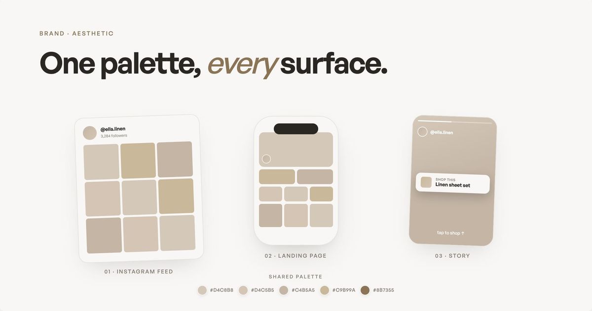
Your aesthetic isn't just what you post. It's a promise.
Every time someone scrolls past one of your photos and stops, something clicks. The colors feel right. The composition feels intentional. The whole thing feels like you in a way that's hard to articulate but impossible to miss. That's your aesthetic, and it's the reason people follow you over the thousands of other creators in your space.
So here's the part that doesn't get talked about enough: what happens when they leave Instagram?
They tap the link in your bio. They land on your page. And in about two seconds, they either feel the same connection they felt on your feed, or they don't. If your landing page looks like a generic template with a headshot and a list of blue links, you've just broken the promise your content made.
This isn't about being precious with design. It's about the gap between how you present yourself on Instagram and how you present yourself everywhere else. That gap costs you clicks, trust, and revenue.
TL;DR
When your link in bio brand aesthetic doesn't match your Instagram feed, you break the trust your content built. Visitors feel the disconnect subconsciously: lower click-through rates, fewer signups, less time on page. Fix it by using your real content as hero images, matching your color palette, keeping your voice consistent, and not defaulting to the template. Your landing page should feel like a natural extension of your feed, not a generic directory.
Key takeaways: link in bio brand aesthetic essentials
- Use your real Instagram content as hero images — not logos or stock photos
- Match your color palette — if your grid is warm, your landing page should be too
- Keep your voice consistent — your captions and your landing page copy should feel like the same person
- Show content, don't just link to it — embed Reels, feature products, display your best work
- Test in Instagram's in-app browser — that's where 96% of your traffic will see the page
- Refresh monthly — treat your landing page as a living storefront, not a set-it-and-forget-it project
What does link in bio brand aesthetic mean for creators?
Let's get specific, because "aesthetic" gets thrown around loosely. For creators, your brand aesthetic (the visual identity that makes your content recognizably yours) is the combination of visual patterns that make your content recognizable before someone even reads the caption. It includes your color palette (warm earth tones, cool neutrals, bold primary colors), your photography style (moody and editorial, bright and airy, candid and unfiltered), your typography choices (if you use text overlays or graphics), and the overall mood or atmosphere your content creates.
Most creators develop this intuitively. You edit your photos a certain way because it looks right to you. You avoid certain colors because they feel off-brand. You've probably never written a brand style guide, but you have one in your head.
The problem: that internal style guide almost never makes it to your link in bio brand aesthetic on the actual landing page (the standalone page Instagram visitors see after tapping your bio link). You pick a Linktree template that looks "nice enough," upload a photo, type in your links, and call it done. The page works functionally. It directs people to the right places. But it doesn't feel like you.
Why the disconnect hurts more than you think
Consider how someone actually arrives at your landing page. They're on Instagram. They've just watched a Reel that made them laugh, or seen an outfit that inspired them, or read a carousel that taught them something. They're in your world. Your colors, your energy, your voice are all around them.
Then they tap your bio link and land on a page that looks like it belongs to someone else entirely. The colors are different. The layout is generic. The vibe is corporate or bland. It's not bad, exactly. It's just not you.
That shift creates what psychologists call a "pattern interrupt" (an unexpected visual shift that breaks the flow of engagement and triggers doubt). Your audience's brain was in a certain mode (engaged with your content, feeling a connection, ready to explore further) and the page disrupted it. The result isn't usually dramatic. People don't consciously think "this page doesn't match her Instagram aesthetic." They just feel slightly less engaged, slightly less trusting, slightly less likely to click through to whatever you're offering.
Over time, those "slightlys" compound. Lower click-through rates (fewer people clicking your links after landing on the page) on your affiliate links. Fewer newsletter signups. Less time spent on your page, which means fewer opportunities to convert a casual follower into a paying customer.
- Lower click-through rates on affiliate links and product recommendations
- Fewer newsletter signups because visitors don't trust the page enough to share their email
- Less time on page as visitors bounce back to Instagram within seconds
- Weaker brand recall because the landing page doesn't reinforce the visual identity your content built
This is why a deliberate link in bio brand aesthetic matters. Research from Later shows that creators with on-brand landing pages see meaningfully higher engagement than those using default templates, because visitors recognize the continuation of the visual story from feed to page in under two seconds.
How does your link in bio affect brand trust?
Here's something that matters especially for creators who monetize through affiliate links: trust is the entire game.
The numbers back this up. According to Sprout Social's 2026 data, 29% of Instagram users make purchases directly on the platform, and 60% interact with brand content multiple times per week. That trust is built through consistent visual identity (the consistent look, feel, and tone that makes your content recognizably yours) across every touchpoint, including your link in bio.
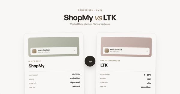
When someone clicks your ShopMy link or taps through to your LTK page, they're trusting your taste. They're trusting that you actually use and recommend this product. They're trusting that their purchase won't be a waste of money.
That trust starts building on Instagram, where your curated content establishes your credibility. But it gets tested when they leave Instagram and land on your page. A polished, branded landing page reinforces the trust. A generic one introduces doubt, even if it's subconscious.
Think about it from the other direction. When you visit a brand's website, you expect it to match their social presence. If a luxury fashion brand's Instagram is all editorial photography and muted tones, you'd be surprised to land on a website that looks like a discount retailer. The same principle applies to personal brands. Your landing page is your website. It should look like it.
What does a strong link in bio brand aesthetic look like?
This doesn't mean hiring a designer or spending weeks on a custom site. It means being intentional about a few specific things:
Research from CreatorFlow's 2026 analysis found that bio links average a 2-3% click-through rate across 1,200+ campaigns. That's the baseline. Creators whose landing pages match their Instagram aesthetic consistently outperform that average because visitors stay longer and click more.
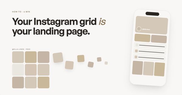
Your hero image should be one of your best photos. Not a logo, not a generic headshot, not a stock image. The image at the top of your landing page is the first thing visitors see. It should be something that immediately communicates your visual style. If your Instagram aesthetic is warm and editorial, your hero image should feel warm and editorial.
Your color palette should carry over. If your Instagram grid has a consistent color story (and most creators' does, whether they planned it or not), your landing page background, text colors, and accent colors should reflect that. A creator whose feed is all warm neutrals and soft pinks shouldn't have a landing page with a stark white background and bright blue buttons.
Your fonts should match your energy. This is subtle but real. A serif font feels different from a sans-serif font. A script font feels different from a geometric one. The typography on your page should match the mood of your content. If your Instagram captions are casual and conversational, a formal-looking page with rigid fonts creates a disconnect.
Your content should be visible, not just linked to. Instead of hiding your best work behind buttons that say "YouTube" or "Podcast," feature it. Embed your latest Reel. Show your recent Instagram photos. Display your product recommendations with actual images. The more your landing page feels like an extension of your content (rather than a directory of links to your content), the more cohesive your brand experience becomes.
Why don't most link in bio tools match your brand aesthetic?
So if matching your aesthetic matters this much, why don't more creators do it?
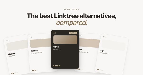
Because most link in bio tools make it hard. Linktree gives you theme presets and custom colors, but you're still working within a vertical stack of buttons. Beacons offers more customization, but the layout is still fundamentally a card-based template. Even tools with "custom themes" usually mean choosing from a set of pre-designed options and tweaking the accent color.
The result: millions of creator pages that look functionally identical. The layout is the same. The structure is the same. The only differences are the profile photo and the link labels. That's not a brand experience. That's a default.
Carrd gives you total design freedom, but you have to build everything from scratch, which requires design skills and time most creators don't have. Building a landing page from your Instagram shouldn't require learning CSS.
What the page should actually do
Beyond looking right, a creator landing page that matches your aesthetic should accomplish three things:
Immediate recognition. Within two seconds of landing, visitors should know it's you. Not because of your name at the top, but because the visual language matches what they just saw on your feed. The colors, the imagery, the overall feel should all say "same person, same quality."
Guided exploration. Your page should make it easy for visitors to find what they're looking for, whether that's your latest content, your affiliate picks, your newsletter signup, or your contact information. The layout should create a natural flow from top to bottom, with your most important links getting the most visual weight.
Trust reinforcement. Every element on the page should feel intentional and polished. Broken links, pixelated images, misaligned text, or clashing colors all erode the trust your Instagram content built. Your page doesn't need to be perfect, but it needs to feel cared for.
How can AI match your link in bio to your brand aesthetic?
This is where the landscape is genuinely changing in 2026. Instead of starting with a blank template and trying to recreate your aesthetic manually, AI-powered tools can now analyze your Instagram content and generate a page that matches your visual style automatically.
The idea is simple: your Instagram posts are data. They contain information about your preferred colors, your photography style, your content topics, and your brand voice. An AI that can analyze that data can generate a landing page that feels like you, without you having to specify every design decision manually.
This approach isn't perfect. AI can miss nuances that you'd catch immediately, and the generated page almost always needs some manual adjustments. But it solves the fundamental problem: instead of starting from a generic template and trying to make it feel like you, you start from something that already feels like you and refine from there.
Your link in bio is where the relationship starts. It's where someone goes from "I like their content" to "I trust them enough to buy what they recommend." If that page doesn't match the quality of the content that brought them there, you're breaking the chain at the most critical point.
What are the most common link in bio mistakes?
The biggest mistake is defaulting to the template. Every link in bio tool gives you a starting point, and most creators never move past it. The result is a page that functions fine but carries zero visual identity. Visitors can't tell whether they're on your page or any of the thousands of other creators using the same layout.
Using a logo as your hero image instead of your best content. Your Instagram followers know your photography, your editing style, your visual world. A logo or generic headshot at the top of your landing page strips all of that away. Use a photo from your actual feed that represents your brand at its best.
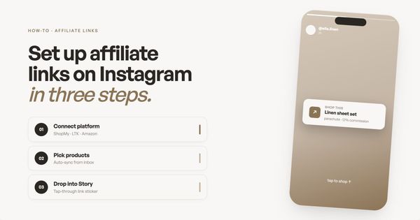
Hiding content behind generic buttons. "YouTube," "Blog," "Shop" tells visitors nothing about what they'll find. Show your content directly on the page: embed your latest Reel, feature product images with prices, display your most recent blog post with its headline. Buttons are navigational, not experiential.
Ignoring mobile. Roughly 96% of your Instagram traffic arrives on mobile, most of it through Instagram's in-app browser. If your link in bio page was designed on a desktop and never tested on a phone, you're optimizing for the wrong experience.
How do link in bio design choices affect SEO?
Your link in bio page is a real web page, which means search engines index it. According to Sprout Social's 2026 data, 60% of consumers interact with brand content on Instagram multiple times per week. When those visitors click through to a well-structured landing page, they generate engagement signals (time on page, scroll depth, click-throughs) that search engines interpret as quality indicators.
A branded, content-rich landing page also creates backlink opportunities. If your page features original content, curated recommendations, or a portfolio of your work, other creators and publications are more likely to link to it as a resource. A generic Linktree with five buttons doesn't earn backlinks.
Page speed matters too. Image-heavy pages with uncompressed photos load slowly on mobile, and slow pages rank lower. The best link in bio tools compress images automatically and serve them through CDNs. If you're building custom, run your page through Google's PageSpeed Insights before going live.
How can you maximize conversions on your link in bio page?
Put your highest-converting action above the fold. Whether that's an affiliate product, a newsletter signup, or a digital product, it should be the first thing visitors see without scrolling. On mobile, "above the fold" means the top 600 pixels of screen height.
Organize by intent, not by platform. Instead of grouping links as "YouTube" and "TikTok" and "Blog," group them by what visitors want to do: "Shop my favorites," "Watch my latest," "Read the newsletter." This matches how people think, not how you organize your content.
Refresh monthly. Your link in bio page isn't a set-it-and-forget-it project. Swap out seasonal affiliate links, feature your best-performing recent content, and remove anything that's not converting. The creators who treat their landing page like a living storefront consistently outperform those who set it up once and walk away.
Final summary
- Your link in bio is the bridge between your Instagram aesthetic and your revenue. When that bridge doesn't match, visitors feel the disconnect and leave.
- Use your real Instagram content as hero images. Not logos, not stock photos. The first thing visitors should see is something that looks like your feed.
- Match your color palette and font energy. If your grid is warm and earthy, your landing page should be too. Serif vs sans-serif changes how your brand feels.
- Show your content, don't just link to it. Embed Reels, feature product images, display your best posts. Visitors should see your work, not a list of buttons.
- Test in Instagram's in-app browser. That's where 96% of your traffic will see the page. If it doesn't look right there, nothing else matters.
- Treat your landing page as a living storefront. Update monthly. Swap seasonal content. Refresh what's not converting. Your aesthetic evolves and your page should too.
Real examples of link in bio brand aesthetic that works
Looking at landing pages that match their creators' Instagram aesthetic is faster than reading another best-practices list. The patterns below show how strong link in bio brand aesthetic shows up in the wild.
- The editorial creator: warm-toned hero photo pulled from their grid, serif headline, three sections (read, watch, subscribe). Looks like a magazine cover. Feels like their feed.
- The minimalist creator: single bold color background matching their feed's dominant tone, one CTA in the same font as their captions, one product showcase below. Restrained on purpose.
- The maximalist creator: full-bleed Reel previews stacked vertically, neon accent colors, expressive typography. Same energy as their grid.
- The wellness creator: soft earth-toned background, hand-photographed product flat-lays, hand-lettered section labels. Calm and consistent with their wellness aesthetic.
- The multi-hyphenate creator: identity-led header with their name and what they do, then sections by outcome (read, work with me, follow my work) styled in their grid's color palette.
Which tools help you match link in bio brand aesthetic to your Instagram?
Most link-in-bio tools force you toward a templated look that flattens whatever aesthetic you spent months building. A few are quietly better at letting your brand carry through.
- Linktree: custom colors and fonts on paid plans. The base layout is hard to escape, so even branded Linktree pages share a recognizable silhouette.
- Beacons: more theming flexibility than Linktree, including custom backgrounds and section types. Still templated, but the templates are richer.
- Carrd: full design control. You can match any aesthetic precisely, but you build it from scratch (and re-build it when your aesthetic evolves).
- Stan Store: optimized for selling. Branding flexibility is moderate; the conversion-first layout is its real value.
- Coreli: generates a landing page from your Instagram automatically, using your real photos, color palette, and content. Closest match to your existing aesthetic without manual design work.
How to track whether your link in bio brand aesthetic is actually working
Aesthetic matching feels subjective, but the signals show up in your numbers. If visitors recognize your page as yours and trust it, they stay longer and click more.
- Time on page. A branded, content-rich landing page should hold visitors 30-60+ seconds. Generic templates often see 10-15 second bounces.
- Click-through rate. Pages that match the source content typically see 1.5-3x the CTR of generic templates on the same audience.
- Newsletter signup rate. A page that earns trust converts roughly 2-5% of visitors to subscribers. A page that breaks trust converts under 1%.
- Return visits. Branded pages get bookmarked and reshared. Generic pages don't. Check whether returning visitors are growing month over month.
- Affiliate conversion rate. The clearest revenue signal. If your audience trusts your link in bio brand aesthetic, they're more likely to follow your recommendations through to purchase.
Frequently asked questions
What are some examples of strong link in bio brand aesthetic?
Strong examples share three patterns: real photos from the creator's feed as hero imagery (not logos), a color palette that mirrors the creator's grid, and typography that matches the creator's captions in tone. Editorial creators tend toward serif fonts and warm palettes; minimalist creators tend toward sans-serif and high-contrast backgrounds; wellness creators tend toward earth tones and hand-lettered accents. The throughline is always that the page reads as a continuation of the feed.
How do I choose the best link in bio tool for my brand aesthetic?
Pick based on how much design work you want to do. Carrd gives you full control but requires you to build everything yourself. Coreli generates a page from your Instagram automatically so it inherits your aesthetic. Beacons offers more template flexibility than Linktree if you want a middle ground. Start by asking: how much time per month do I want to spend on this? If the answer is 'almost none,' an AI-generated approach saves the most effort. If the answer is 'I enjoy designing,' a builder like Carrd gives the most control.
What analytics should I track for my link in bio page?
Track click-through rate per link (which destinations actually pull clicks), time on page (engagement), and conversion events tied to your primary goal (newsletter signups, product sales, affiliate clicks). Compare branded landing pages against generic templates on the same audience. Aesthetic alignment with your Instagram should show up as higher CTR, longer sessions, and stronger conversion. If it's not showing up, your page isn't matching as well as you think.
Why does my link in bio page look different from my Instagram?
Most link in bio tools use generic templates that don't adapt to your visual brand. The result is a page that functions fine but doesn't carry your color palette, photography style, or overall aesthetic.
Does brand consistency on my landing page affect revenue?
Yes. When your page matches your Instagram aesthetic, visitors stay longer, click more, and trust your recommendations. The disconnect between curated content and a generic page creates friction that reduces conversions.
How do I make my link in bio match my Instagram aesthetic?
Use your best Instagram photos as hero images, match your color palette, keep your copy voice consistent with your captions, and don't default to the template. Tools like Coreli automate this by generating a page from your Instagram content.
If you want to see what that looks like for your brand, enter your Instagram handle on Coreli. It takes 30 seconds. If the generated page captures your aesthetic, you'll feel it immediately. If it doesn't, you've lost nothing but half a minute. Not sure which tool will match your aesthetic? Our honest comparison of Linktree alternatives covers the full landscape. Or read the complete guide to creator landing pages for the full strategy from tools to affiliate revenue.
How do design choices impact SEO for link in bio pages?
Search engines index your link in bio page like any web page. A content-rich, well-structured page with fast load times, compressed images, and original content generates better engagement signals than a generic link list. These signals (time on page, scroll depth, low bounce rate) influence search rankings.
What are the benefits of using a custom domain for a bio link page?
A custom domain (like yourname.com instead of linktr.ee/yourname) builds brand recognition and domain authority over time. It also looks more professional when shared, gives you full control over analytics, and means you're not dependent on a third-party platform's URL structure.
How can I maximize conversions with my link in bio page?
Put your highest-converting action above the fold, organize links by visitor intent rather than platform, refresh content monthly, and test everything in Instagram's in-app browser. Pages that match the creator's Instagram aesthetic consistently see higher click-through rates than generic templates.